Value optimization

Maximizing Strategic Decision-Making Across Global Projects

Title

UX Design Specialist

Time frame

Aug 2021 - June 2022

Summary

I led the UX design efforts for a web-based app focused on optimizing communication and decision-making across multi-million-dollar global projects. From user interviews and heuristic analysis, I addressed critical usability challenges. The result was an intuitive, stable platform that improved visibility, accountability, and strategic alignment for frontline contributors, portfolio leads, and executives.

I led the UX design efforts for a web-based app focused on optimizing communication and decision-making across multi-million-dollar global projects. From user interviews and heuristic analysis, I addressed critical usability challenges. The result was an intuitive, stable platform that improved visibility, accountability, and strategic alignment for frontline contributors, portfolio leads, and executives.

Results

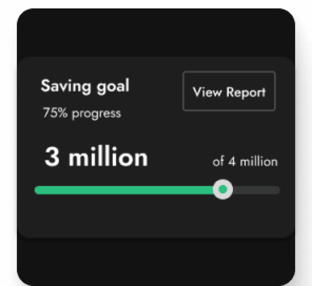
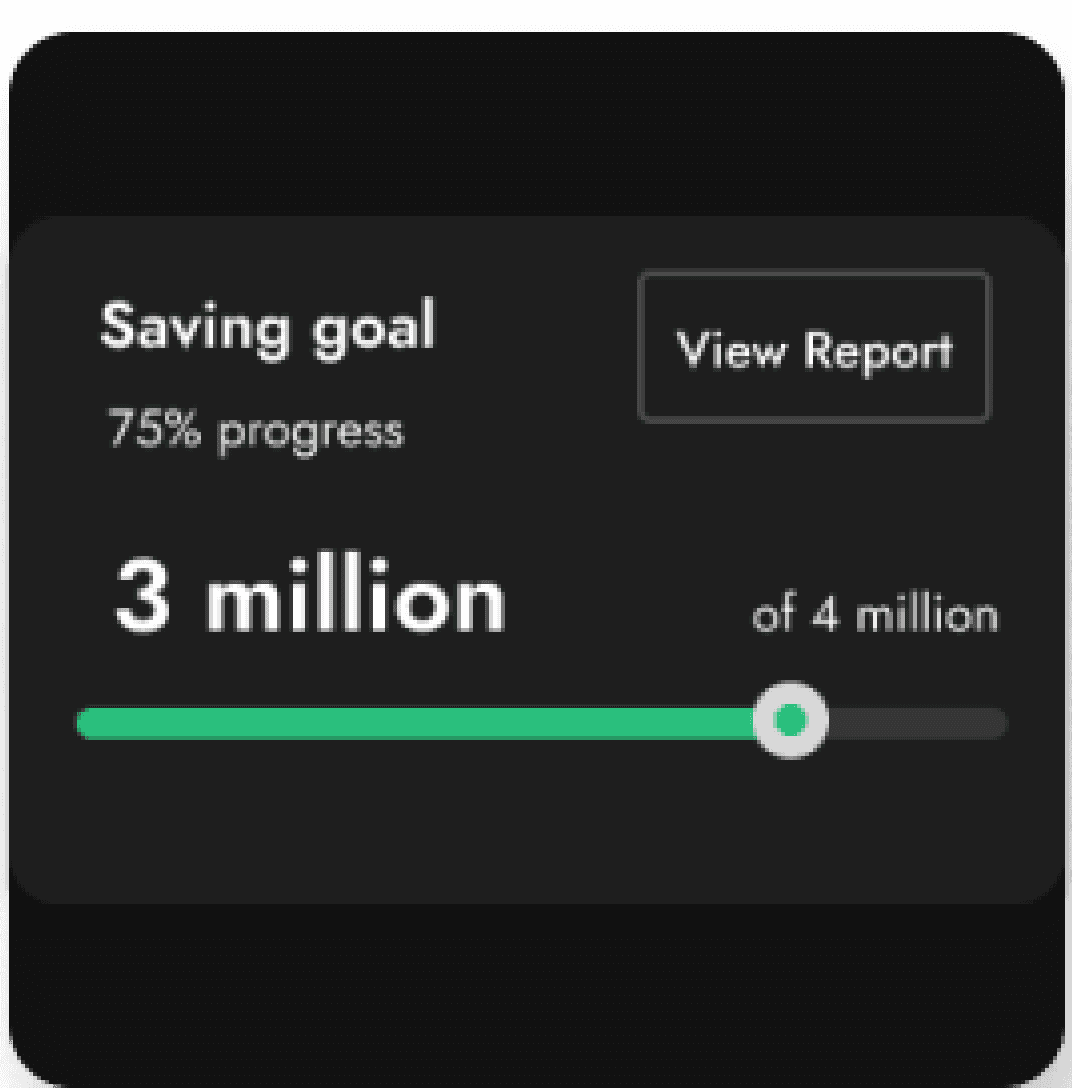
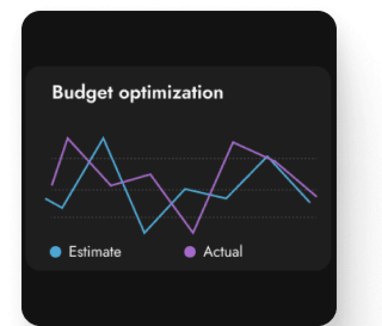
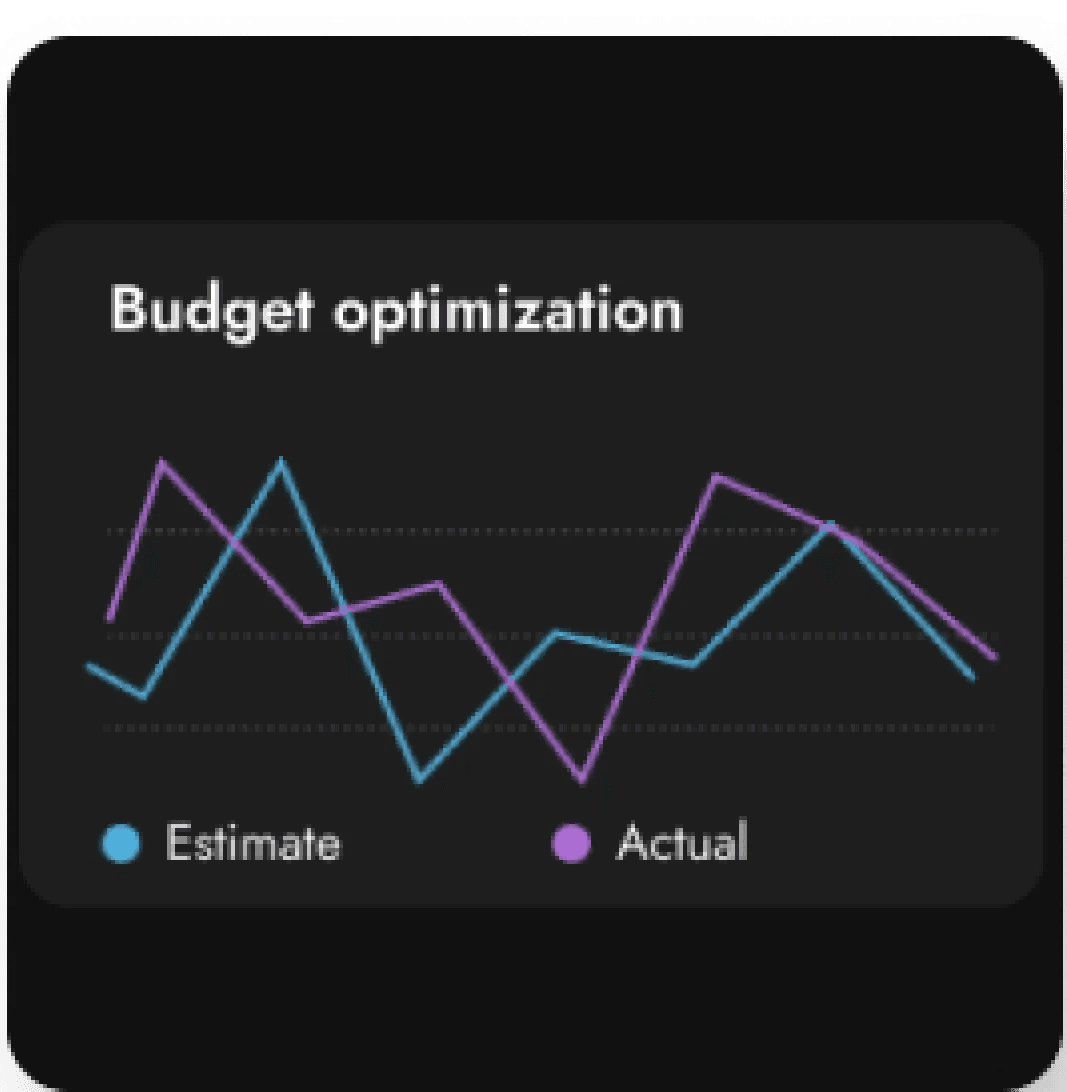
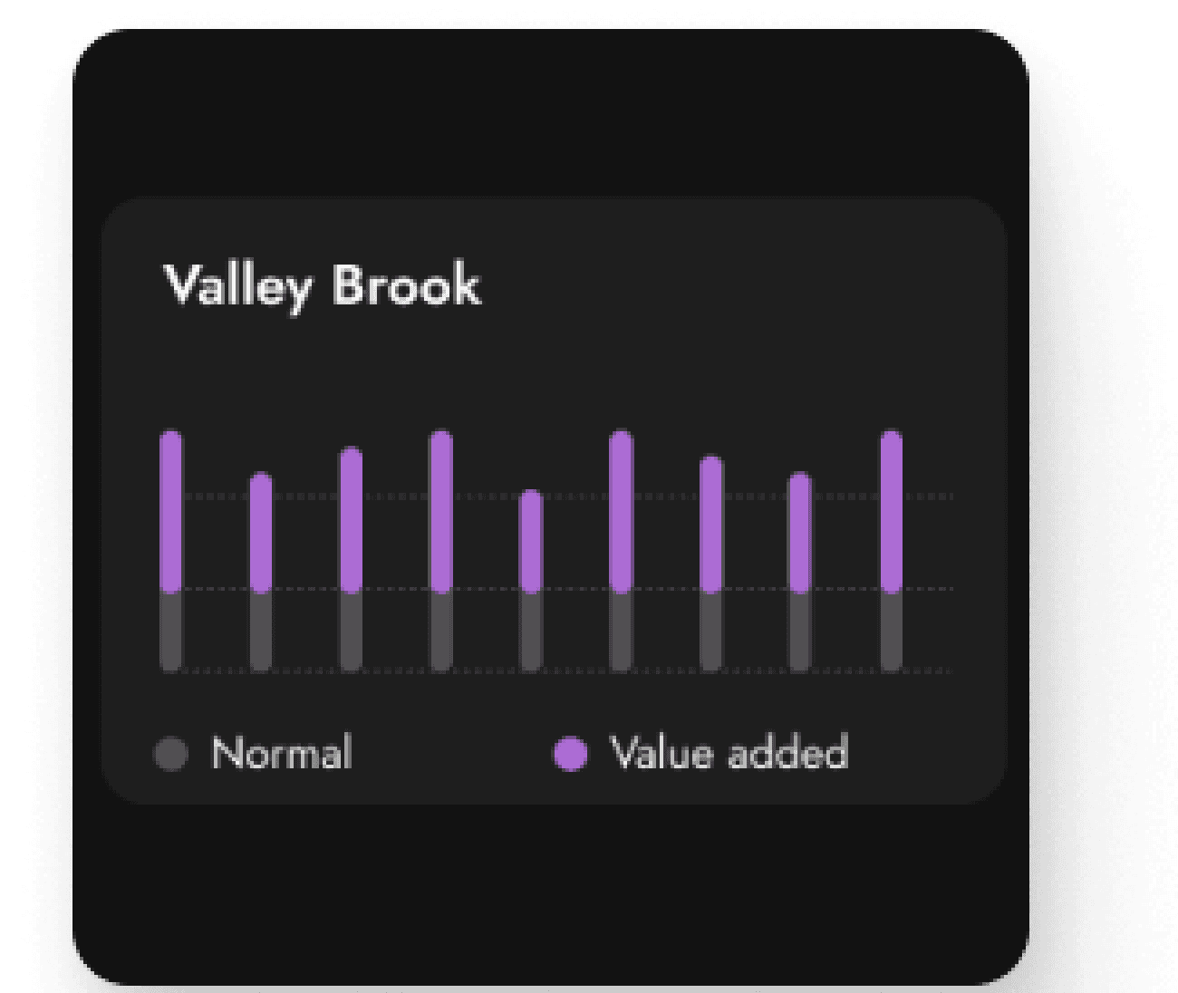
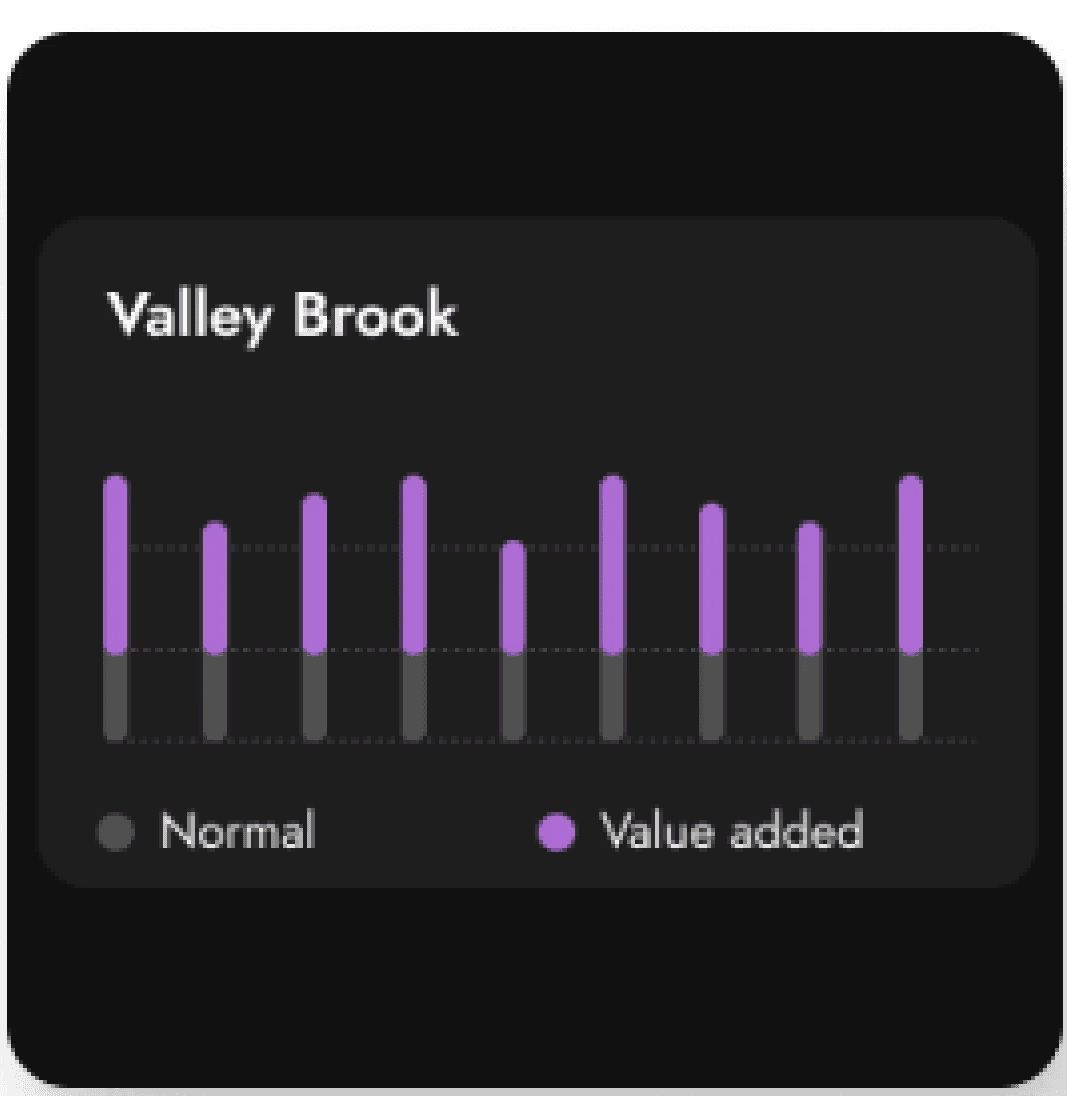
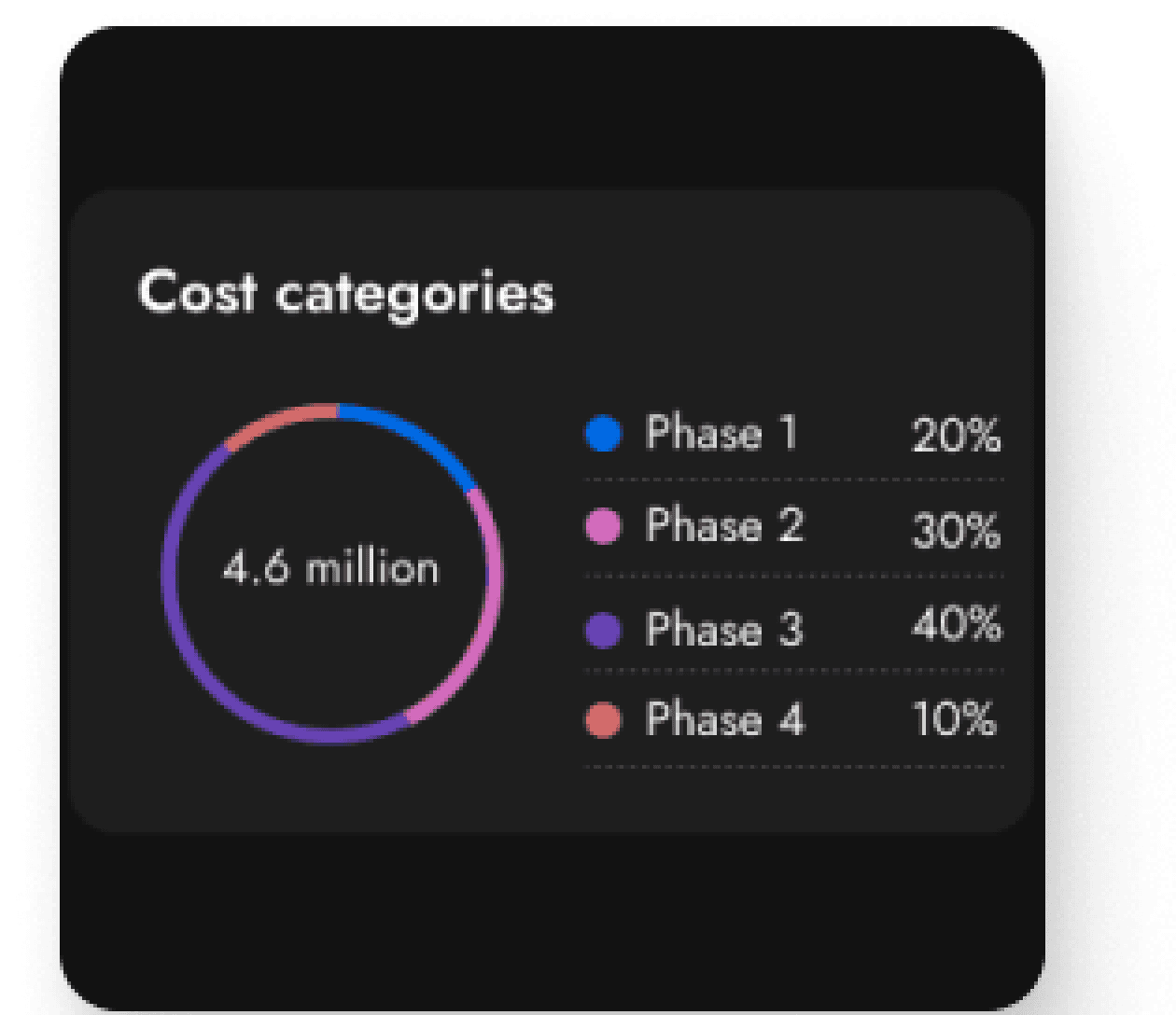
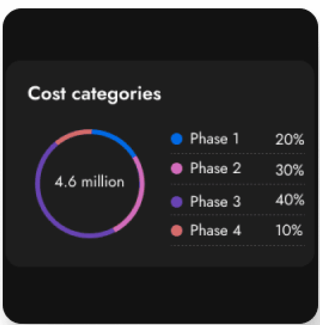
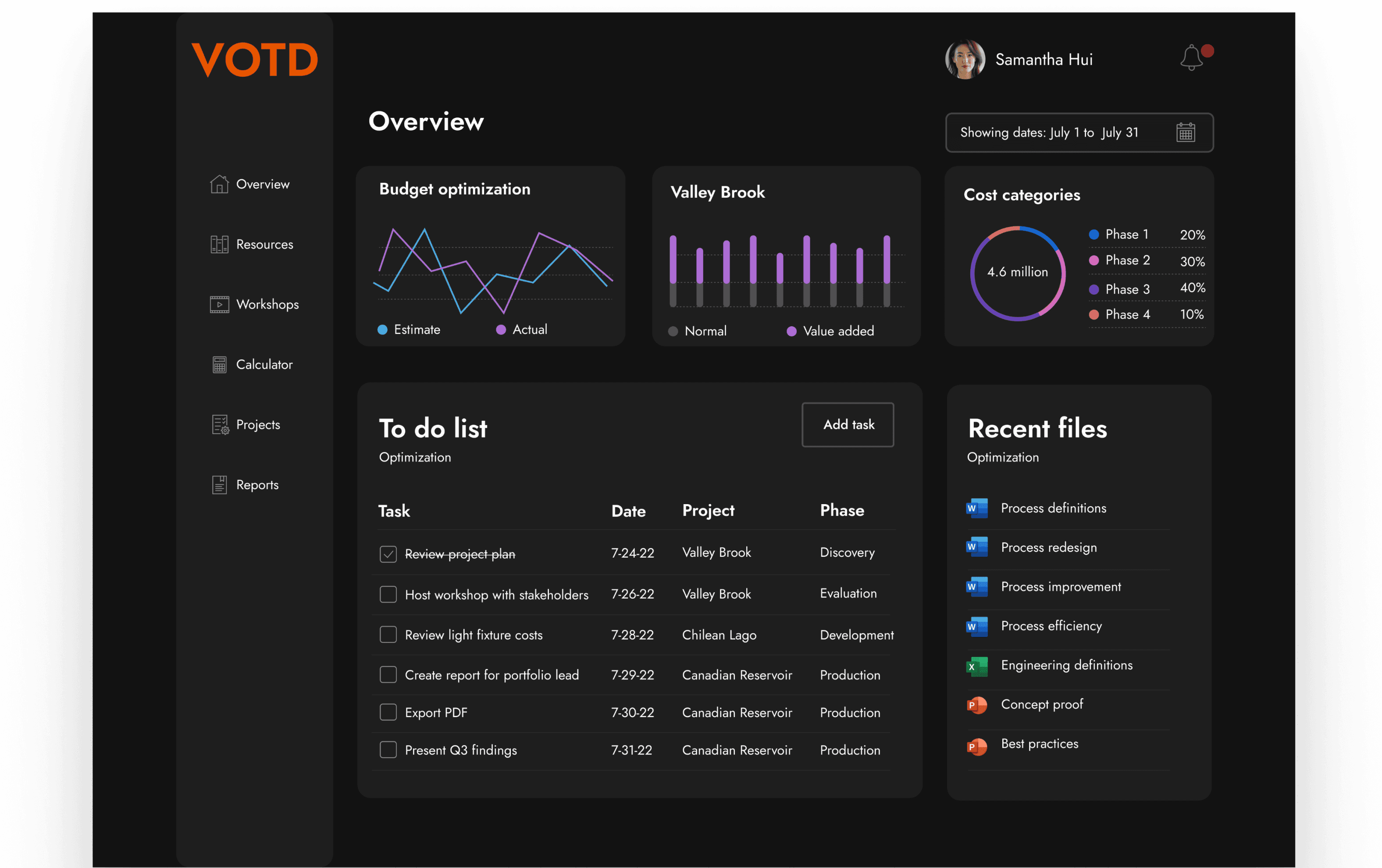
Visual Dashboards empowered decision-making by creating clear data visualizations enabled actionable insights across all user roles: front line, portfolio leads, and executives.

Increased reporting efficiency: Eliminated unexpected errors, improved data accuracy, and added automated notifications

Improved organizational communication: Enhanced reporting tools allowed clear visibility from study specialists to executives

Optimized strategic alignment: Intuitive dashboards and robust data visualization empowered informed decision-making

Study specialists showed how value was added through the project life cycle. Leads had improved oversight with automated reporting and actionable dashboards. Executives had real-time visibility into global project performance.

40%

Task completion rate improvement

Task completion rate improvement

60%

Reduction in data entry errors

87%

Faster reporting sequences

User interviews

User feedback

Existing information
Information architecture

Features

Functionality

UX Metrics

Ease of use

DESIRED

OUTCOMES

HUMAN

ELEMENTS

INFORMATIONAL

ELEMENTS

UX
Challenge

End users
Stakeholders
Engineers
Subject matter experts

Challenge

Challenge

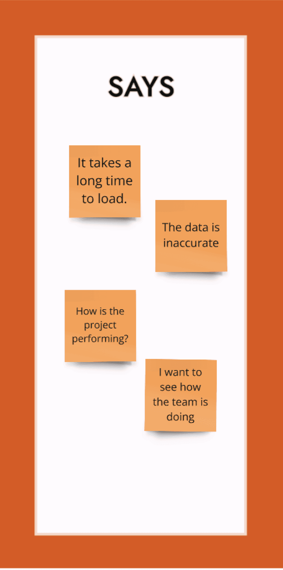
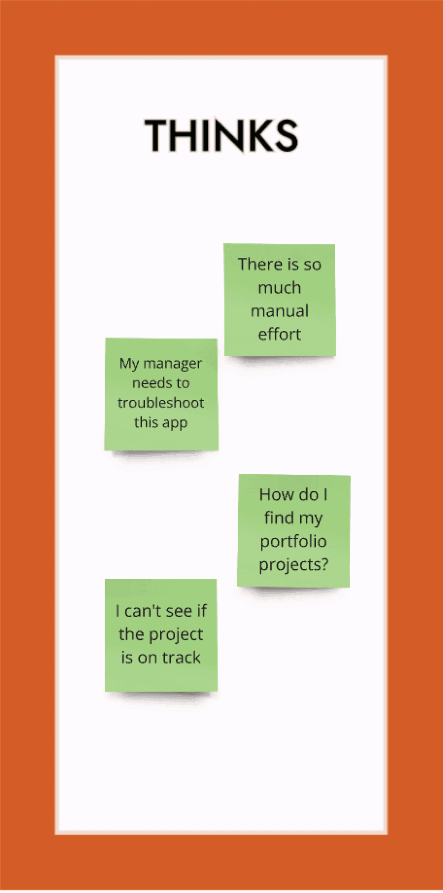
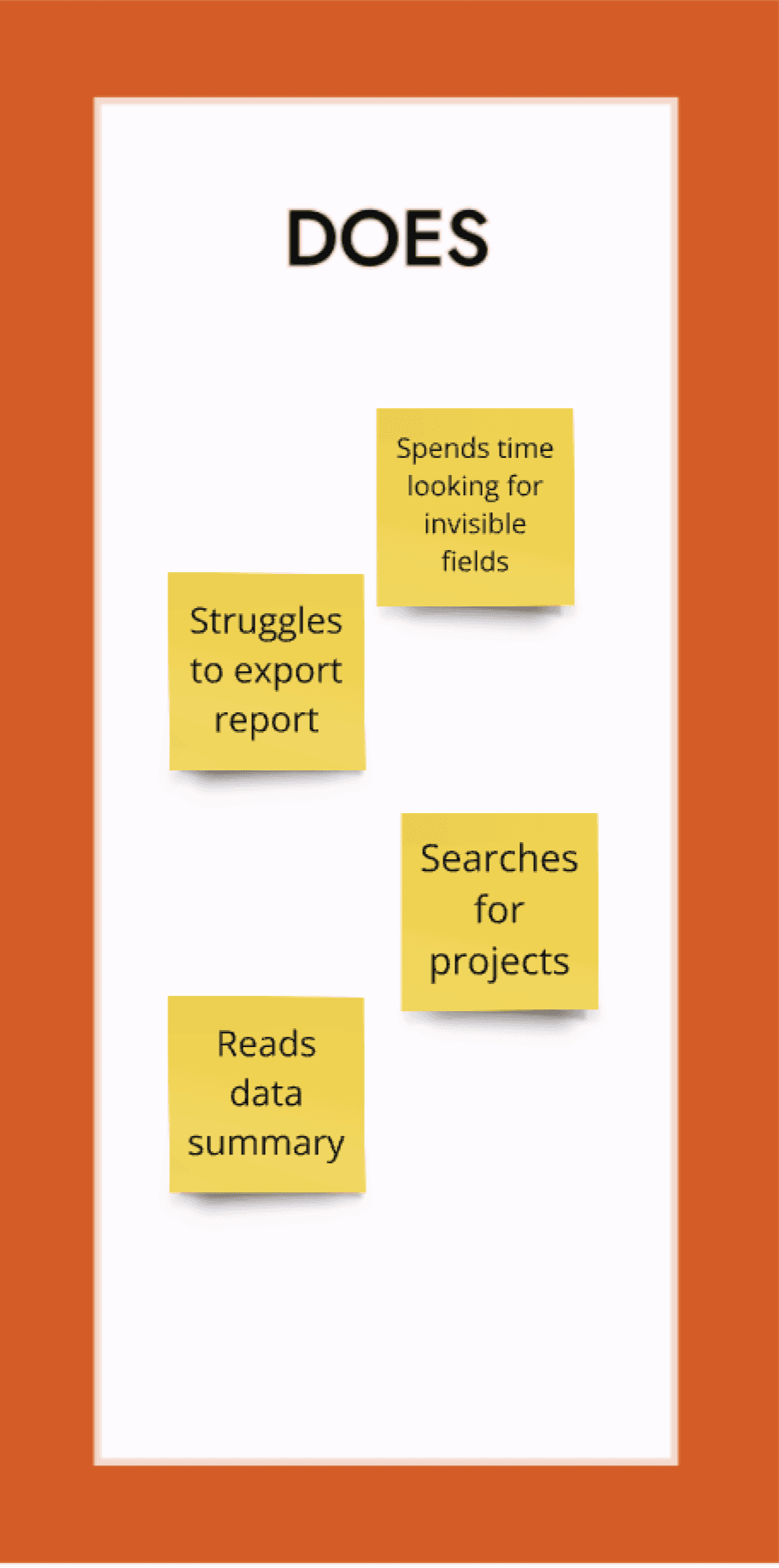
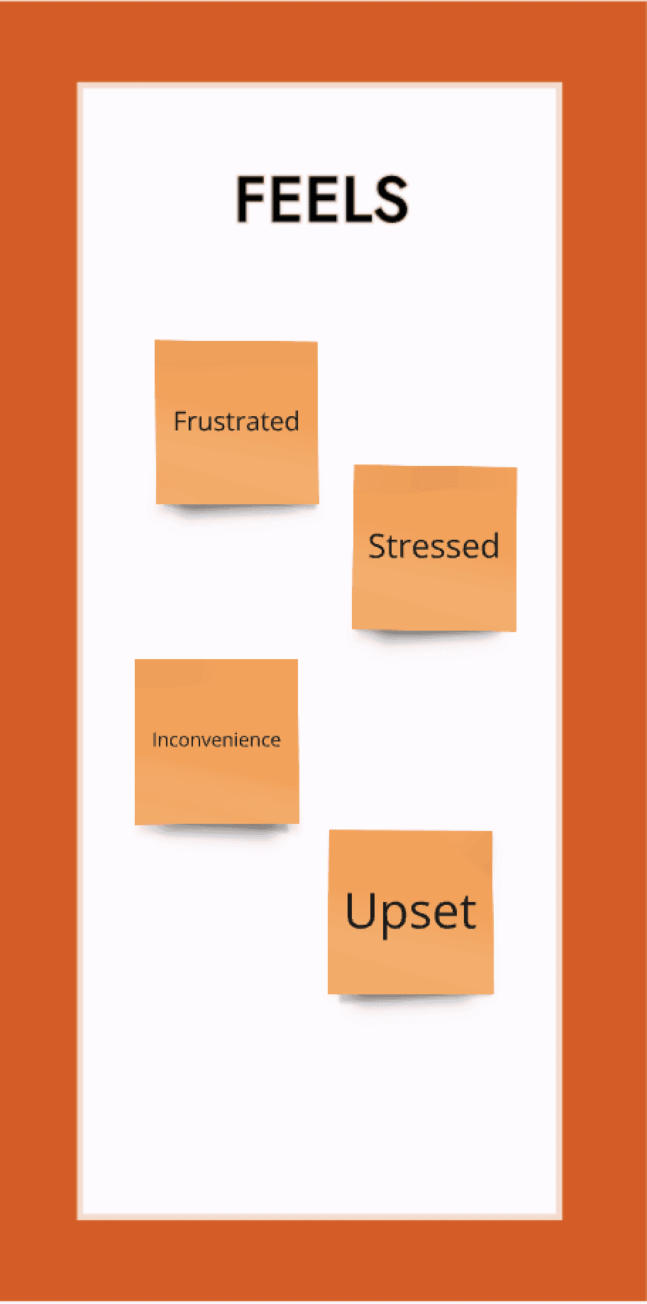
Qualitative interviews with 15 end users led to the discovery of many critical usability issues that impacted productivity in time on task and difficulty reversing application errors.

Movable user interface: Users could accidentally click or drag UI components, disrupting workflow

Lack of search filters: Searching data was restricted to alphabetical order and no bookmarks for current project

Error prone manual entry: Fields allowed accidental formula changes, requiring manual troubleshooting and support to fix

Phantom data: Data totals would not add up or make sense, and it was unclear why there were inconsistencies

No automation: Notifications and escalations relied on manual intervention which meant more time spent in meetings

The unconventional design pattern was chalk full of unexpected complexity that would often mean it was easier to close out the entire application and restart it than to fix the issue at hand.

Strategy

Strategy

To address these challenges, I developed a structured UX strategy around improving the ease of use of this outdated, complex, dysfunctional web app.

To address these challenges, I developed a structured UX strategy around improving the ease of use of this outdated, complex, dysfunctional web app.

User research: Conducted 1:1 interviews with users across Canada, Chile, and Australia to understand workflows and pain points.

User research: Conducted 1:1 interviews with users across Canada, Chile, and Australia to understand workflows and pain points.

Design Critique: Analyzed feedback to prioritize usability issues based on severity and frequency

Design Critique: Analyzed feedback to prioritize usability issues based on severity and frequency

Heuristic analysis: Identified recurring challenges, including slow loading times, unintuitive filtering, and inefficiencies.

Heuristic analysis: Identified recurring challenges, including slow loading times, unintuitive filtering, and inefficiencies.

UX Roadmap: Created a prioritized design roadmap aligned with key user pain points and business objectives

UX Roadmap: Created a prioritized design roadmap aligned with key user pain points and business objectives

Collaboration with product team: Ensured user stories were tracked in JIRA for transparency and accountability.

Collaboration with product team: Ensured user stories were tracked in JIRA for transparency and accountability.

Improving visibility for portfolio leads and executives relied heavily on empowering both frontline specialists with a stable, easy to use web app to have reliable global performance data

Improving visibility for portfolio leads and executives relied heavily on empowering both frontline specialists with a stable, easy to use web app to have reliable global performance data

Empathy map

Empathy map

Process

Process

I implemented the UX roadmap using a four-step process:

I implemented the UX roadmap using a four-step process:

UX Field Roadmaps: Created initial layouts to map key UI components.

UX Field Roadmaps: Created initial layouts to map key UI components.

Design Critique: Built high-fidelity designs aligned with the company’s design system

Design Critique: Built high-fidelity designs aligned with the company’s design system

User feedback loops: Conducted iterative testing sessions with study specialists and portfolio leads in English and Spanish

User feedback loops: Conducted iterative testing sessions with study specialists and portfolio leads in English and Spanish

User evaluation: Each iteration refined the product to maximize efficiency and usability

User evaluation: Each iteration refined the product to maximize efficiency and usability

Key improvements:

  • Stable UI: Essential UI components were made static.

  • Search Filters: Enabled filtering by name, region, project size, and recent activity.

  • Tooltips: Provided embedded resources and troubleshooting guides.

  • Error Prevention: Introduced pre-defined fields to minimize manual data entry errors.

  • Report Automation: Enabled in-app report creation and PDF exports.

  • Notifications: Automated alerts reduced reliance on manual follow-ups.

Key improvements:


Stable UI
: Essential UI components were made static.

Search Filters: Enabled filtering by name, region, project size, and recent activity.

Tooltips: Provided embedded resources and troubleshooting guides.

Error Prevention: Introduced pre-defined fields to minimize manual data entry errors.

Report Automation: Enabled in-app report creation and PDF exports.

Notifications: Automated alerts reduced reliance on manual follow-ups.

Learnings

In this low UX maturity environment, there were limited options available for usability testing. This meant the UX design organization of 40+ members had to work with limited resources

I worked with the product owner and product manager and UX leaders to help the organization acquire an enterprise subscription to The Baymard Institute which has over 100,000+ hours of UX research.


This meant that every project could benefit from leveraging proven design conventions to make it easier for users to use the apps we were creating for BHP.


Each UX designer was on 3-5 projects, so this access made an exponential positive impact across the design organization.


It allowed us to balance cybersecurity risks, compliance, constraints, and UX needs in an effective way.

With over 1,000 proven design guidelines, each project was able to incorporate relevant UX research findings to maximize the efficacy of the apps users were using for their workflow.

Expressive. Innovative. Strategist. Leader.

Expressive. Innovative. Strategist. Leader.

Expressive. Innovative. Strategist. Leader.