Title
Senior UX Design Lead
Time frame
June 2022 - Feb 2023
Summary
Thanks to the respective expertise of our UX team (myself, UX researcher, and content strategist) we were able to enable an easier enrollment experience for 20 million+ Schwab clients.
9.5
Net promoter score (NPS)
96%
System usability score
93%
Visual desirability
Results
Challenge
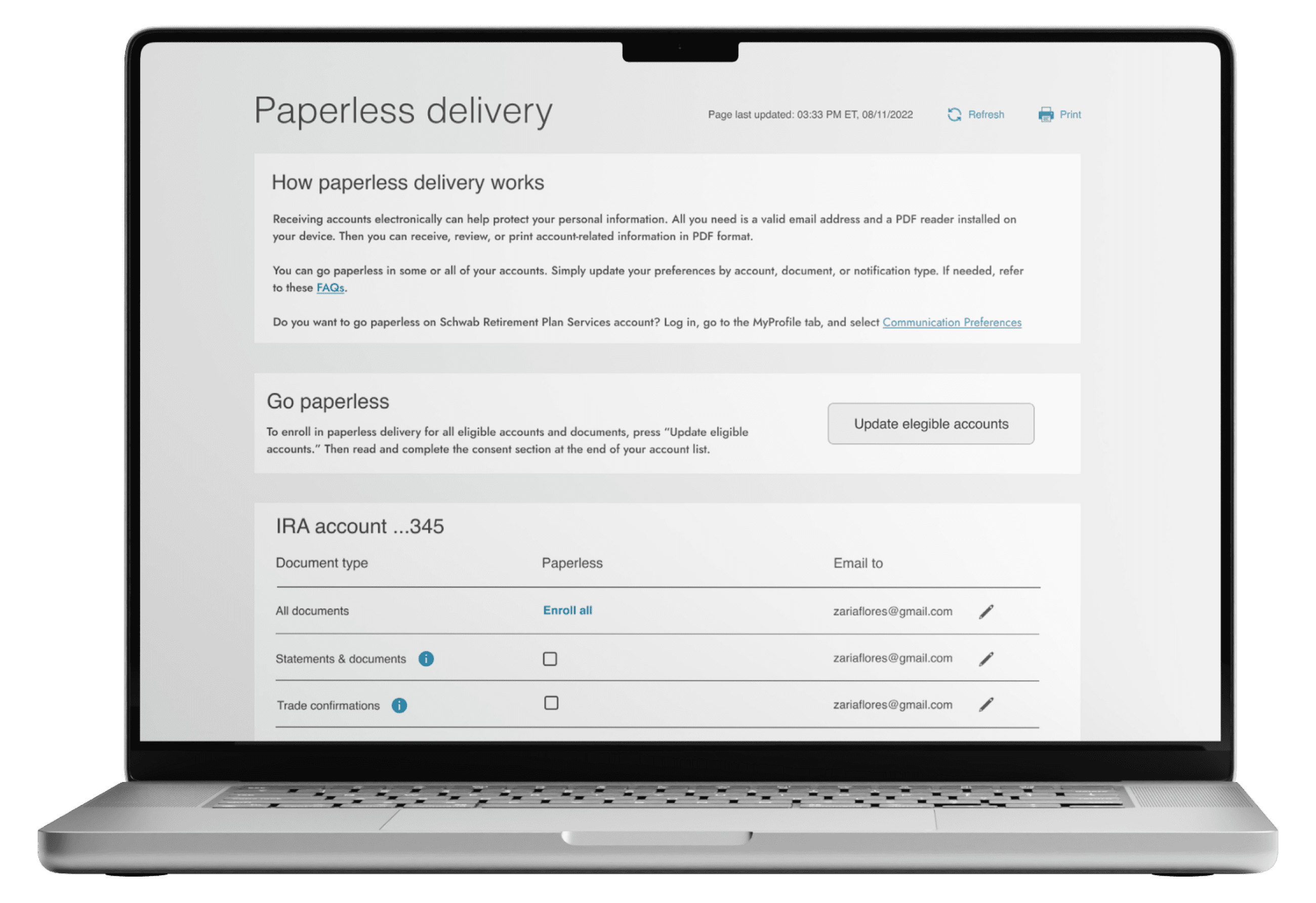
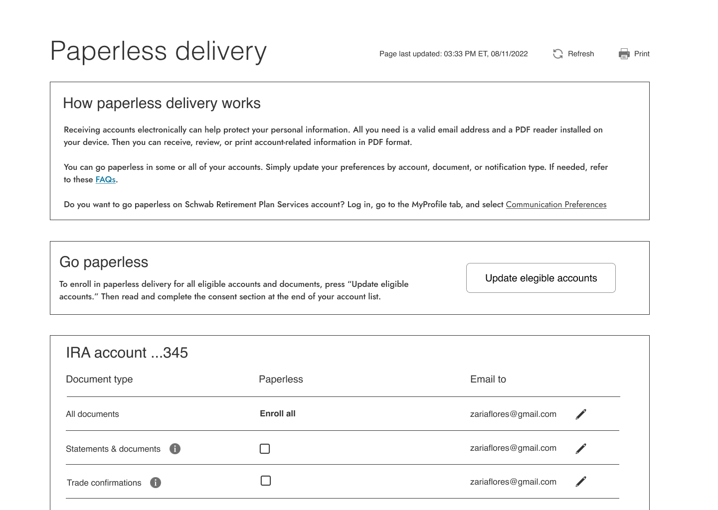
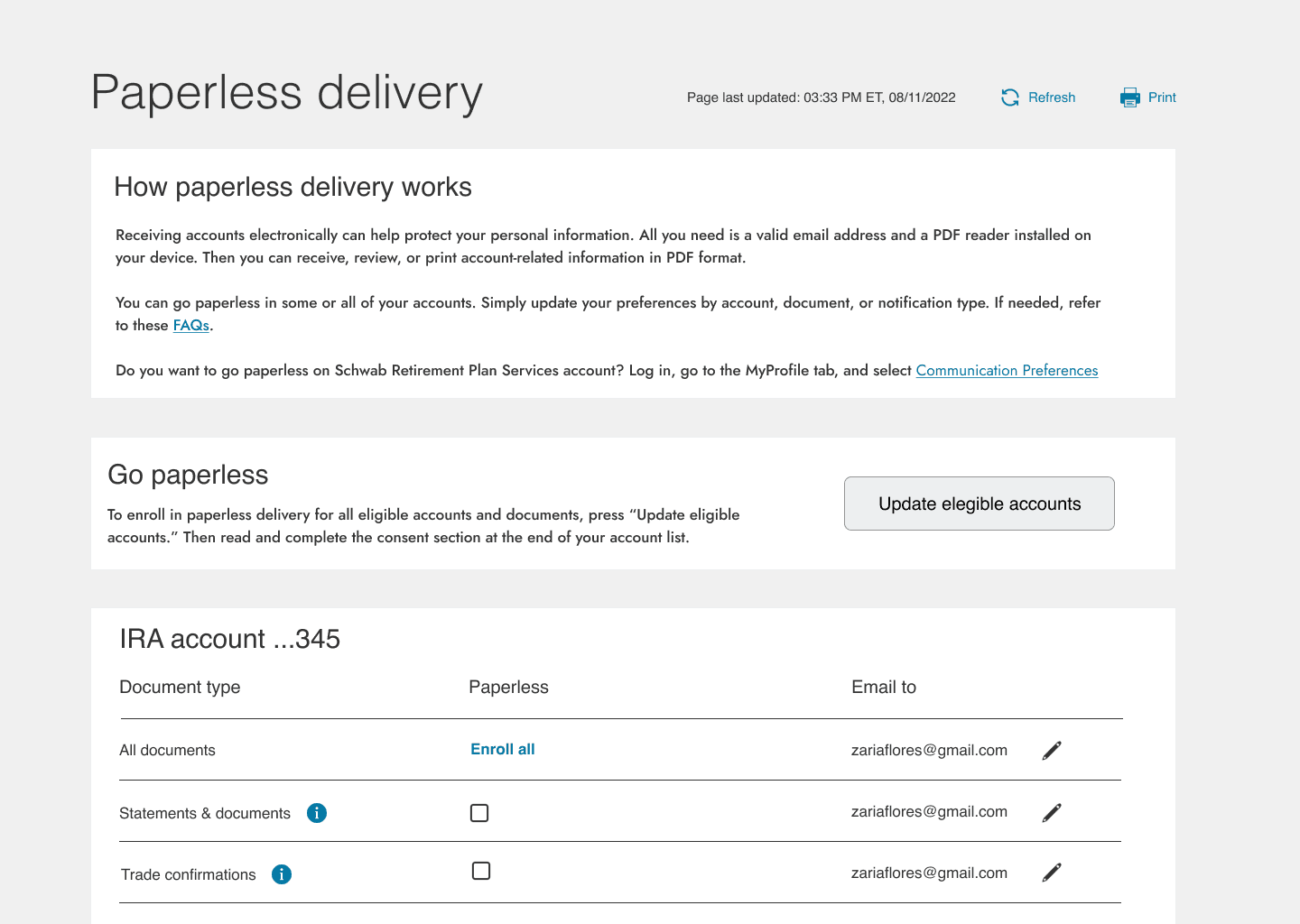
Users needed it to be easier to enroll at the document level, account level, and across all accounts without reaching out to customer support to help them sort it out.
New design system: A key part of this redesign process was shifting from the older design system to the new one.
Unconventional design: Checkboxes appeared in a table format in the 3rd column which is unusual for checking off.
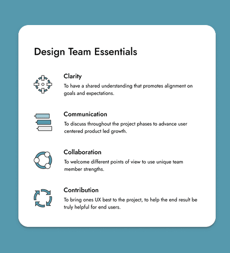
Collaboration: As a team, we would have to align content, research, and design UX disciplines to reach milestones.
Timeline: With the upcoming addition of millions of TDA customers, it was key to make the deadline.
Align UX activities: With a dedicated UX content strategist, UX researcher, and myself, we co-created a completion schedule
Enrollment ease combined with product design project management were the main challenges this project. I set out to implement the new design system, boost ease of use, and streamline UX individual contributor activities.

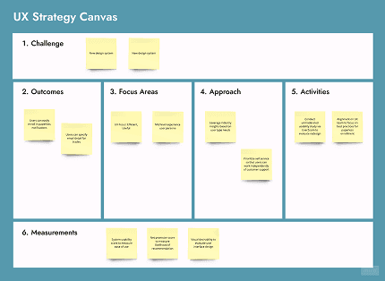
Strategy
To make informed decisions about the UX strategy, I started by mapping out key pieces of information we would need in order to drive best outcomes for end users.
Forrester Research: With industry research, I was able to tap into FinTech industry benchmarks for competitive analysis.
Heuristic evaluation: The current experience was audited using heuristic principles to determine & prioritize bottlenecks.
Vision: The problem we wanted to solve for clients was to make paperless enrollment easier on multiple levels.
Goals: By improving the experience, customers would be able to self serve and the business would save on sending letters.
Plan: I outlined features, timeline, and UX team contributions inside of the UX Field Roadmap to align collective efforts.
With clarity around what matters most to users and the business, my UX team and I knew what we needed to deliver. We set out to implement the needed changes.
Process
To bring the UX strategy to life, we followed Enterprise Design Thinking practices. This is where I worked very closely with the UX team to ensure that we aligned our efforts to improve UX.
Stakeholder Management: I collaborated extensively with the product owner and product manager to ensure alignment.
Ideation: The content strategist and I worked very closely to imagine new ways that paperless enrollment could improve.
User interface: The new ideas were visualized through mockups, using the new design system, and prototypes.
Content: My content strategist advised on language to balance user needs, business objectives and company requirements.
Usability testing: With the UX researcher, we co-wrote screener, questions, and testing protocol to evaluate design.
Given the success of the usability testing results, we had evidence supporting that our collective contributions had yielded an experience that benefited our end users.
Learnings
Each project presents new opportunities to refine techniques and scale up the next level of UX mastery. As I reflect on this project, here are some of my key learnings:
Scalable solutions: I would advocate stronger for new design system patterns that could be used across the UX department
Tool integration: To connect the dots between UX and business results, I would advocate also for additional business analytics.
Project objectives: To make onboarding new UX contributors onto an existing team, I would create a 1 pager about project objectives and constraints to better align UX team.
Thanks to the work of the UX team, we were genuinely able to improve the user experience for paperless enrollment across multiple UX metrics resulting in a superior experience.